- Your Creative Odyssey with Hipster Roboto
- Posts
- 5 Punk Logos That Scream Design Rebellion
5 Punk Logos That Scream Design Rebellion
DYI Design Lessons from Punk Rock Legends
Hipster Roboto
06 Jun

Hello, Robotos!
Music and design are inseparable in the world of punk rock. They blend like a solar eclipse and social media influencers (weak metaphor, I know). But to make a statement, you need a logo that's not just strong but also rebellious, a brand identity that’s so iconic it communicates your message before the first chord of a song is played.

THE RAMONES
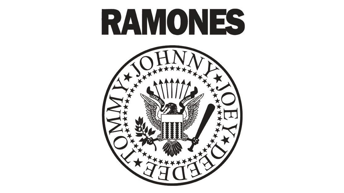
First on our list is The Ramones, pioneers of punk rock, formed in 1974 in New York City. Their iconic chant "Hey Ho, Let’s Go!" has influenced generations of music lovers, punks, and aspiring guitarists. Their logo, designed by Arturo Vega, is just as iconic as their music. Vega's design uses US symbols like the presidential seal, a baseball bat, an apple tree branch, and each band member's name, presenting the band as a symbol of American culture (and rebelling against it) like an "American Apple Pie."
BLACK FLAG
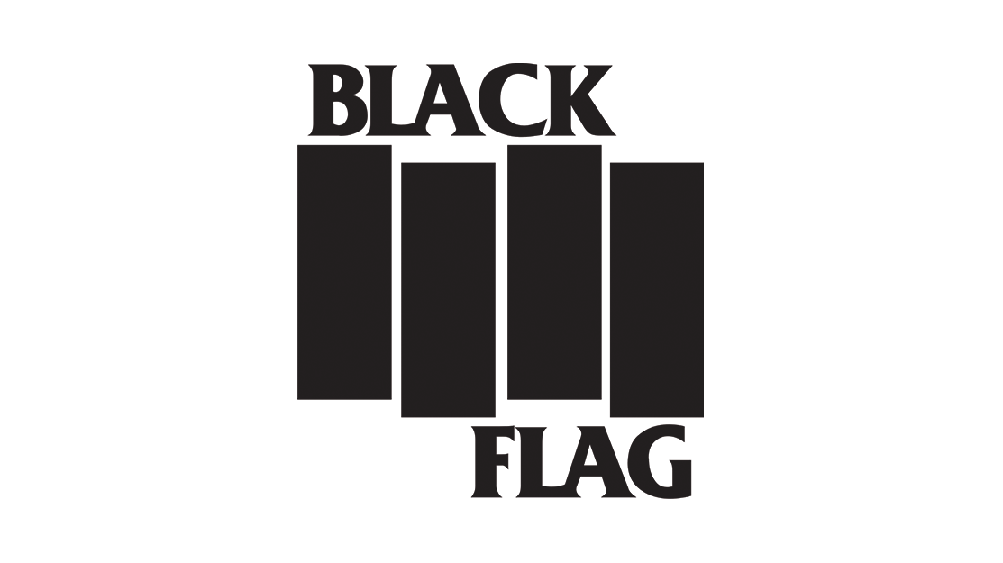
Black Flag, a band known for its DIY (do it yourself) attitude, has a logo that perfectly illustrates this spirit. Its simple yet powerful design is a testament to punk rock’s mentality. Black Flag's logo has become a go-to tattoo among punk rockers, accompanied by iconic songs such as Nervous Breakdown, Fix Me, and Wasted. Designed by Raymond Pettibon, the brother of guitarist Greg Ginn, the logo shows a single flag waving in the wind, representing ripples. Ironically, many fans are surprised when they learn its true meaning.
DEAD KENNEDYS
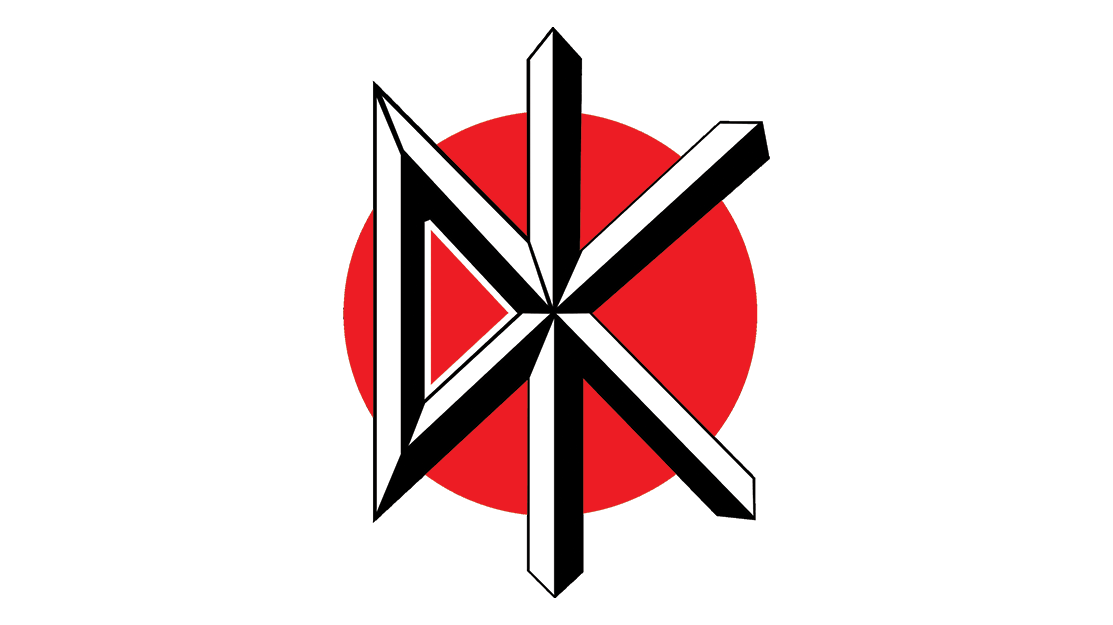
The Dead Kennedys, founded in San Francisco in 1978, merged British punk's experimental techniques with American hardcore punk's raw energy to bring classics such as California Uber Alles, Nazi Punks Fuck Off, and the ever-eternal Holiday in Cambodia. Their raw lyrics offer shocking and satirical critiques of the social and political issues during the infamous Reagan-era America.
Their logo features an abbreviation of their initials using thick geometric lines. It combines solid colors such as red (symbolizing aggression, power, and danger), black (representing fight and strength), and white (representing loyalty).
BAD RELIGION
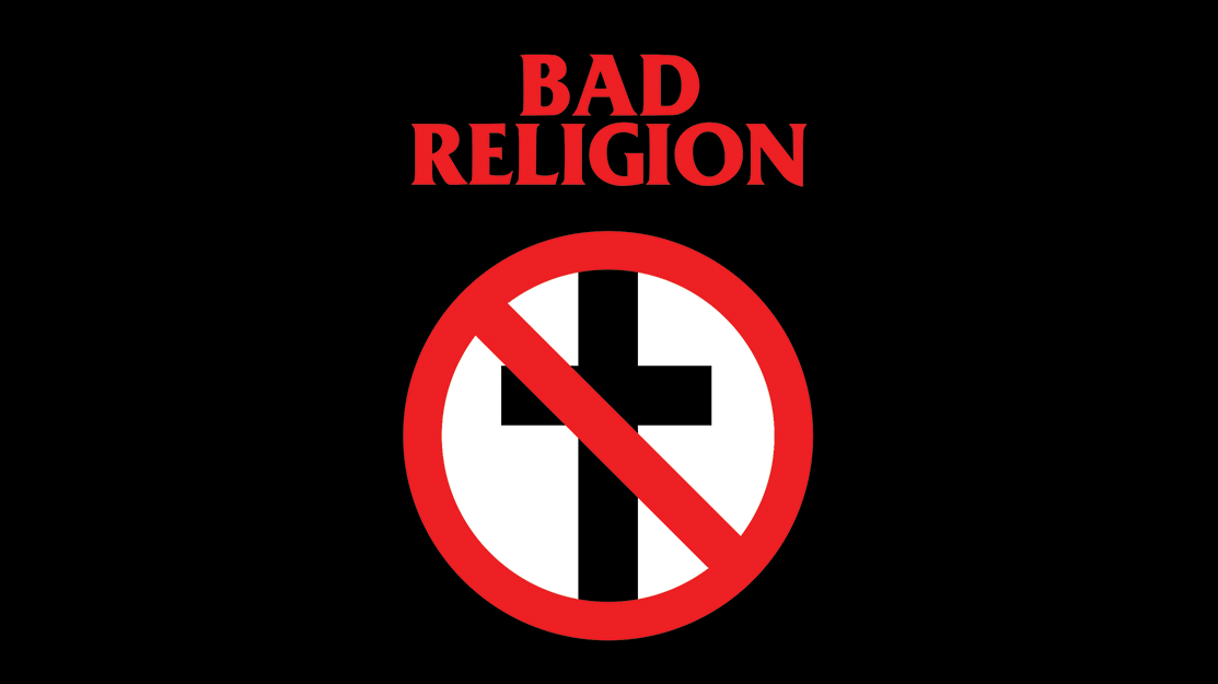
In 1989, Bad Religion's guitarist and Epitaph Records founder, Brett Gurewitz, designed the band's logo, the Crossbuster. The logo features a Christian cross with a red slash and is considered simple, controversial, and iconic. The font used in the logo is Friz Quadrata (bold), created by Vic Caruso. The band’s lead singer, Greg Graffin, explained that the band never regretted choosing the name or the logo since it set the band apart from the beginning, encouraging listeners to think for themselves:
"None of us ever regretted choosing that name or the logo. We consider the Crossbuster a kind of 'no parking sign,' meaning 'you won't find Christianity here.' The name and logo established us from the beginning as a band willing to think for itself, suggesting our songs would have a more philosophical edge. It gave us the freedom to do what we wanted and kept us from dealing with people unreasonably critical of music that challenged convention.” Graffin explained.
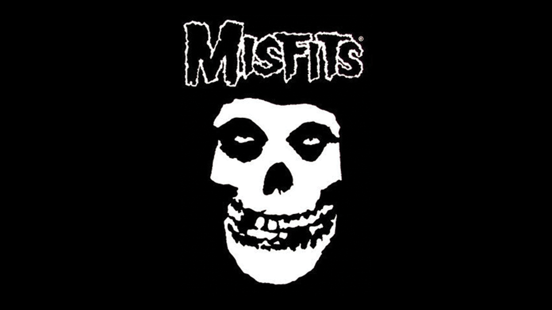
THE MISFITS
And finally, the Misfits!
Founded in 1977, their logo captures the band's passion for horror film themes in their music. Its iconic grinning skull, surrounded by darkness, is the perfect example of how a logo can become bigger than the band itself. The band’s founder and lead singer, Glenn Danzig, "found" the image in the 1946 film “The Crimson Ghost,” and it became their signature image that perfectly captures classic punk songs such as Last Caress, Die Die My Darling, and Hybrid Moments.

From iconic chants to rebelling against authority, there’s no denying that these bands knew the power of a logo, whether it was intentional or not. That’s the power of a well-designed identity. Now, tell me which band you think should be included here.
Don’t forget to share it with your punk friends and subscribe.
See you in the moshpit,
Hipster Roboto
